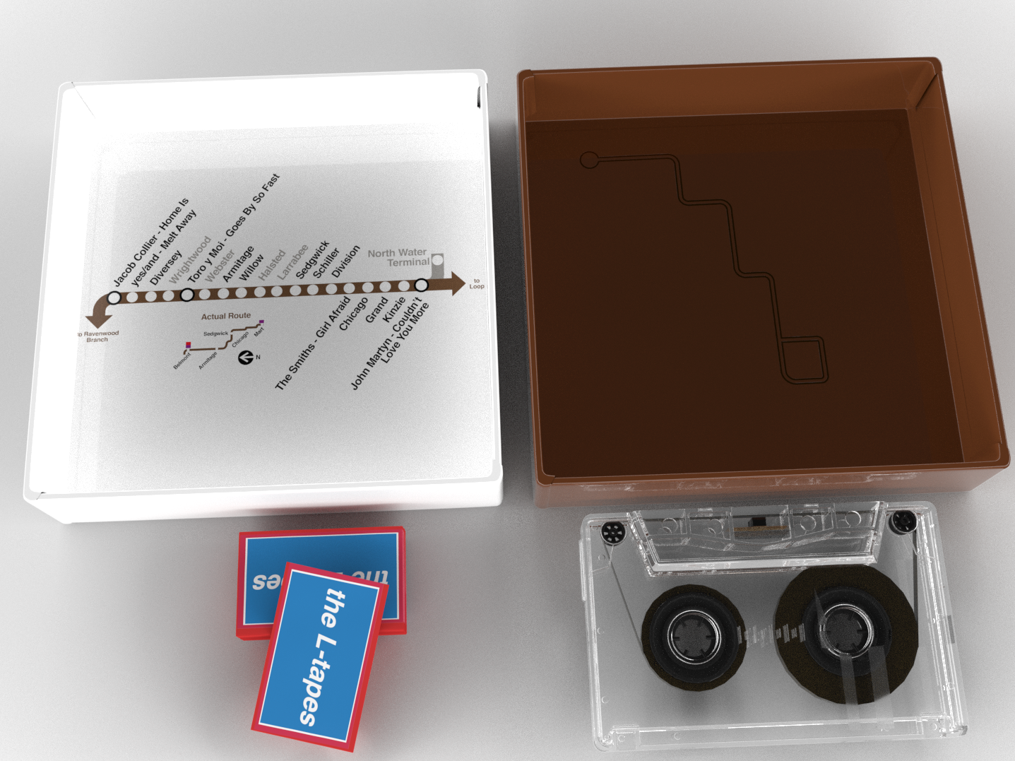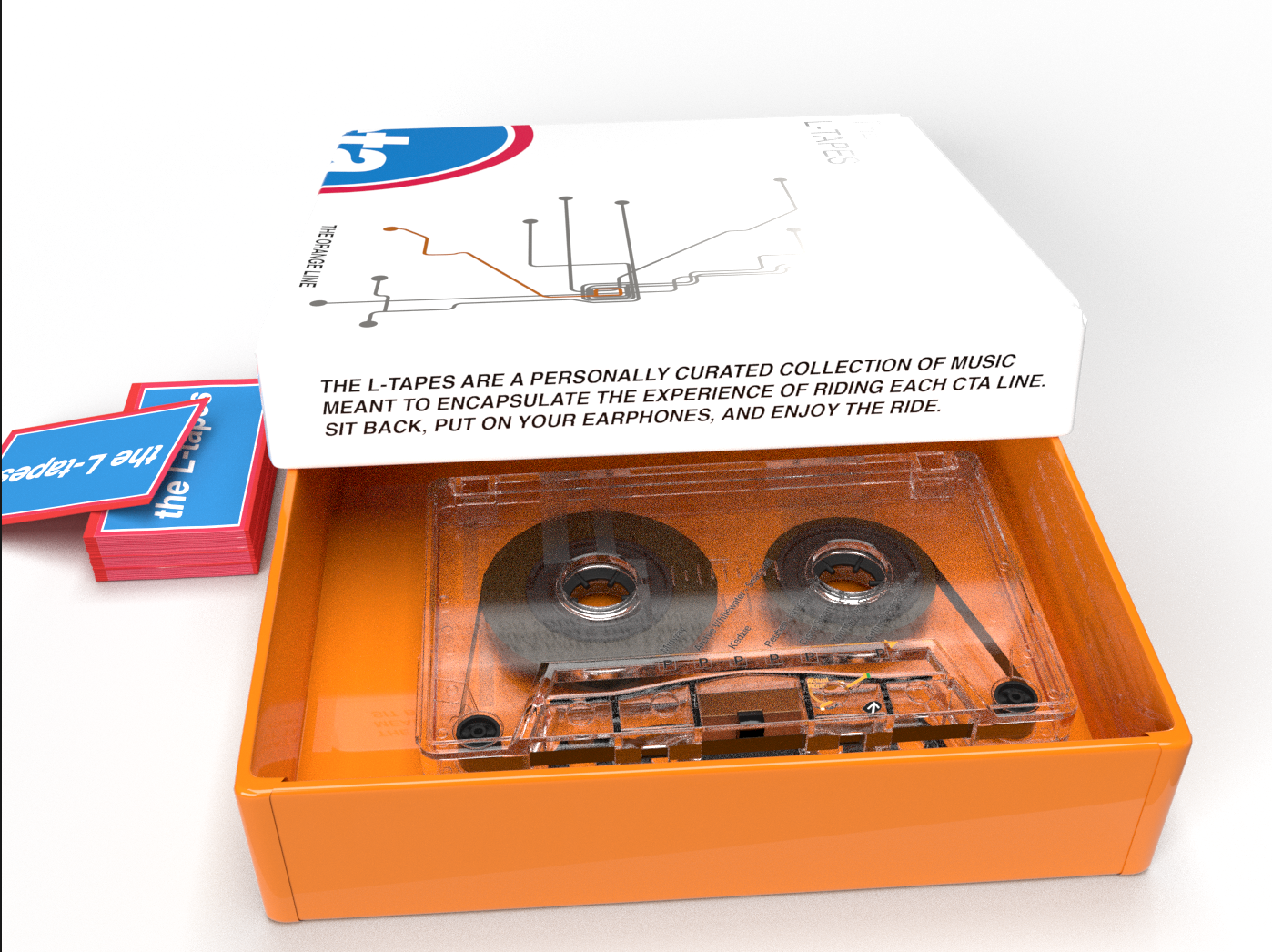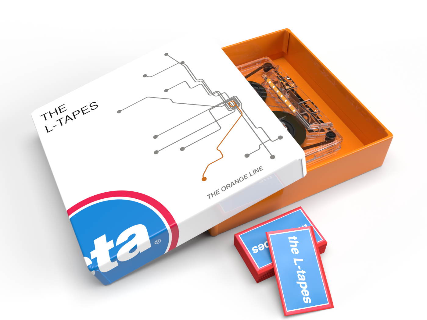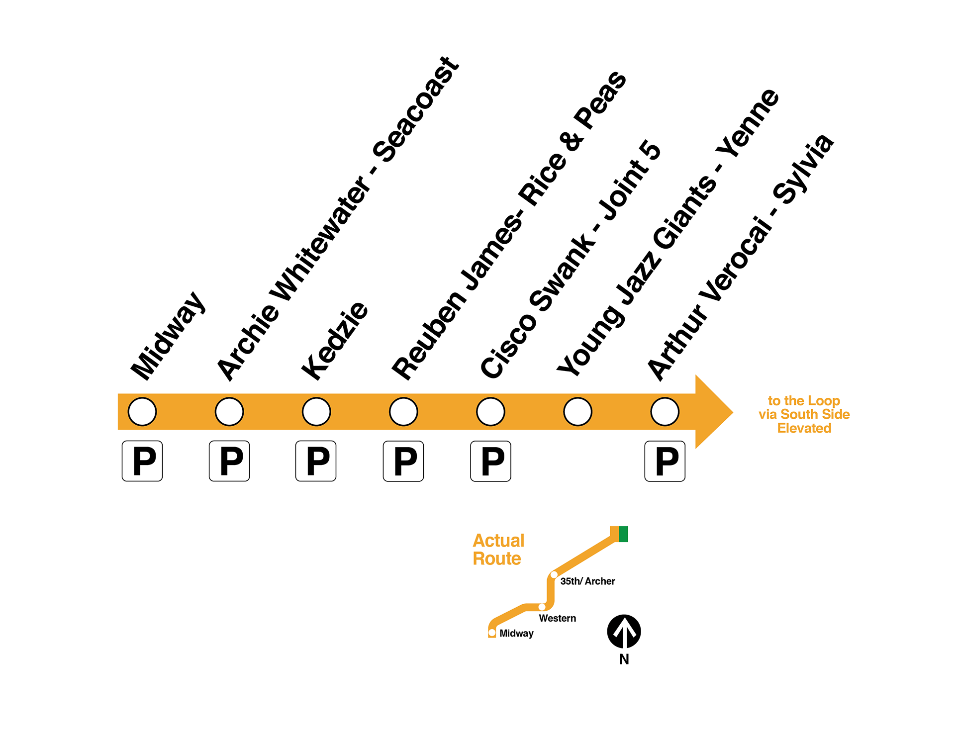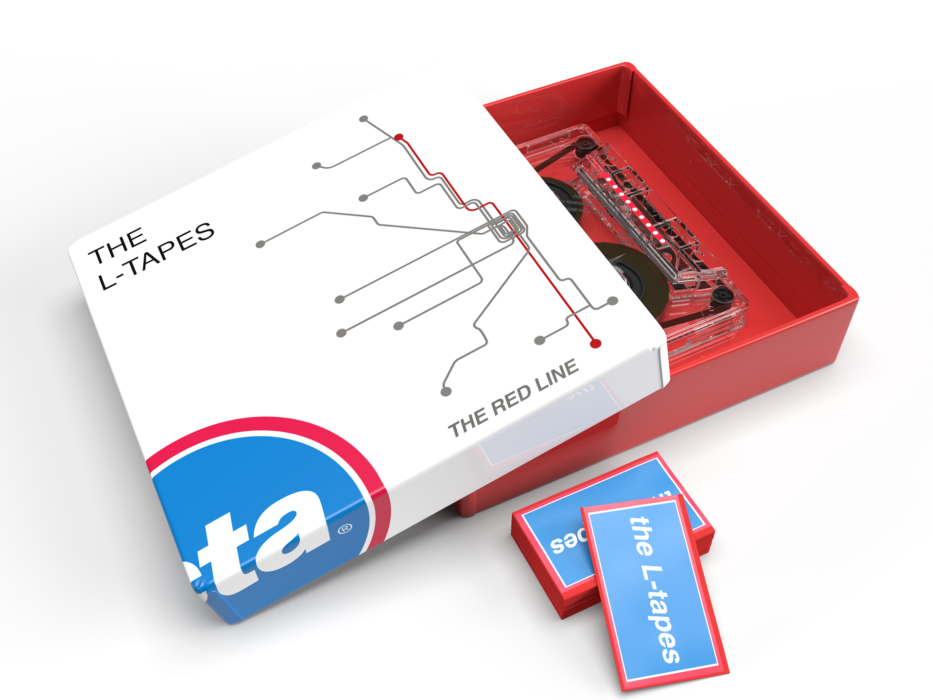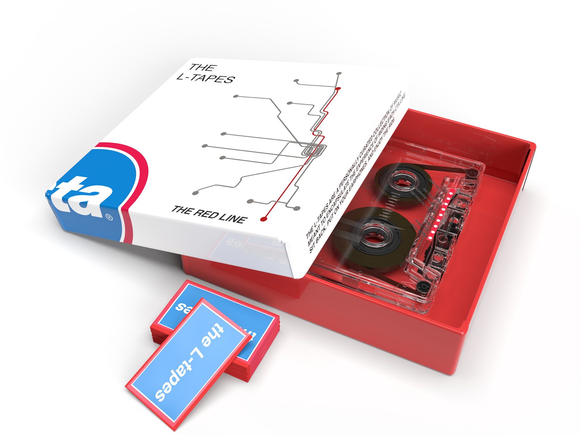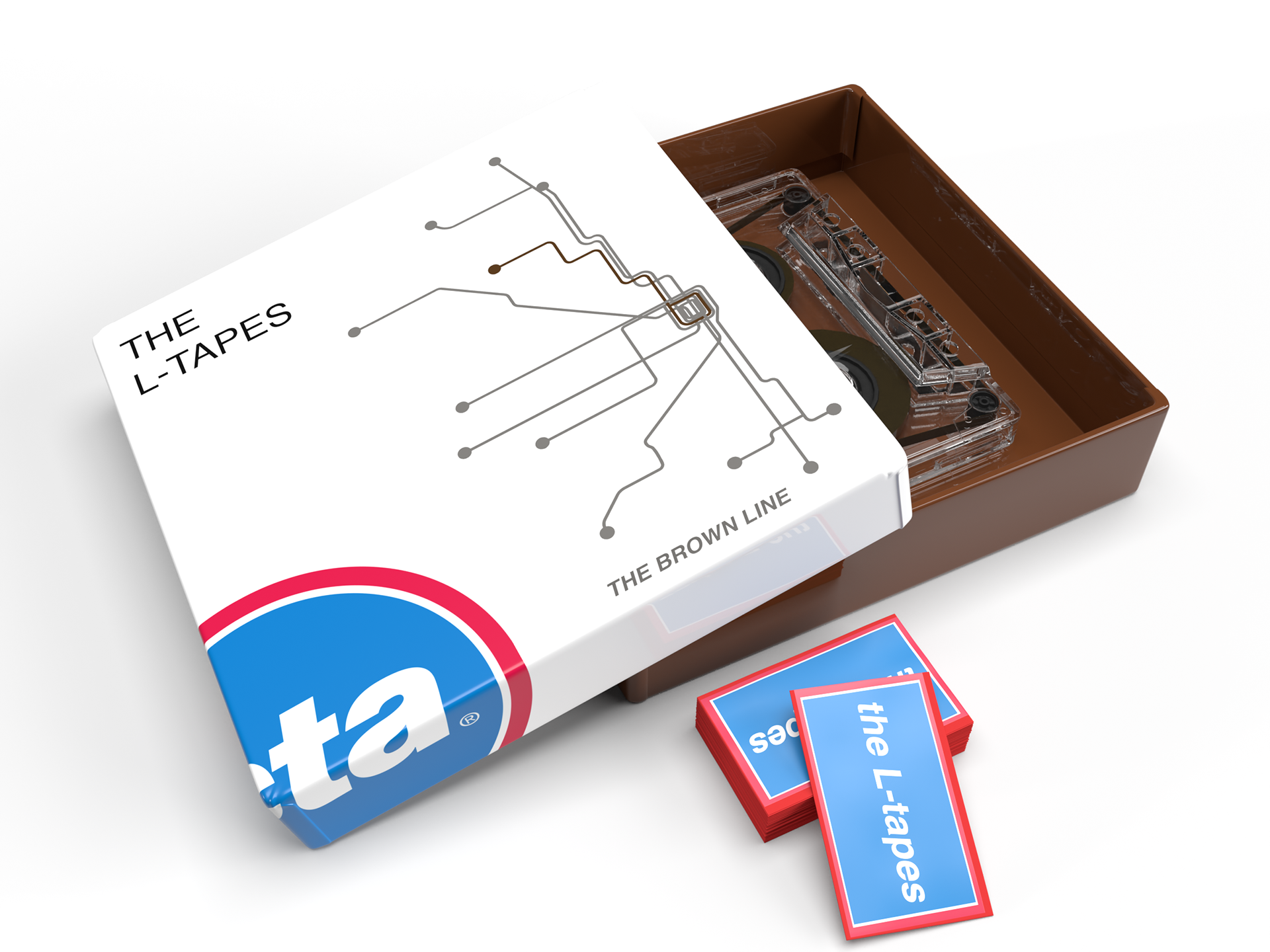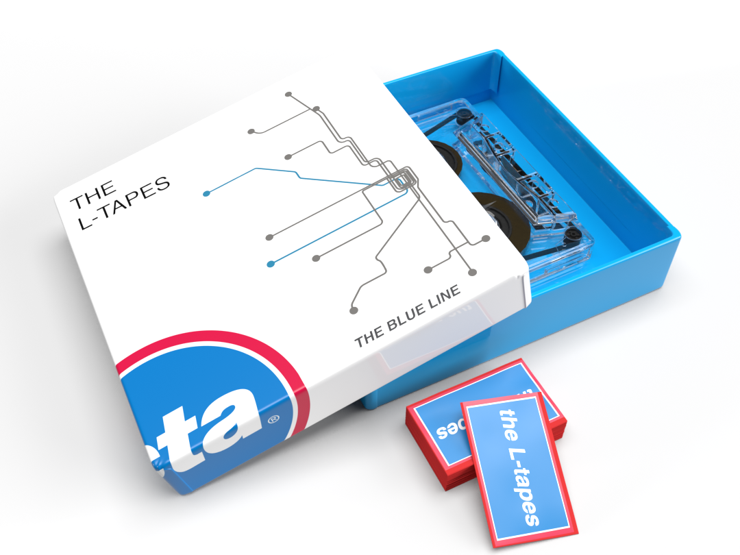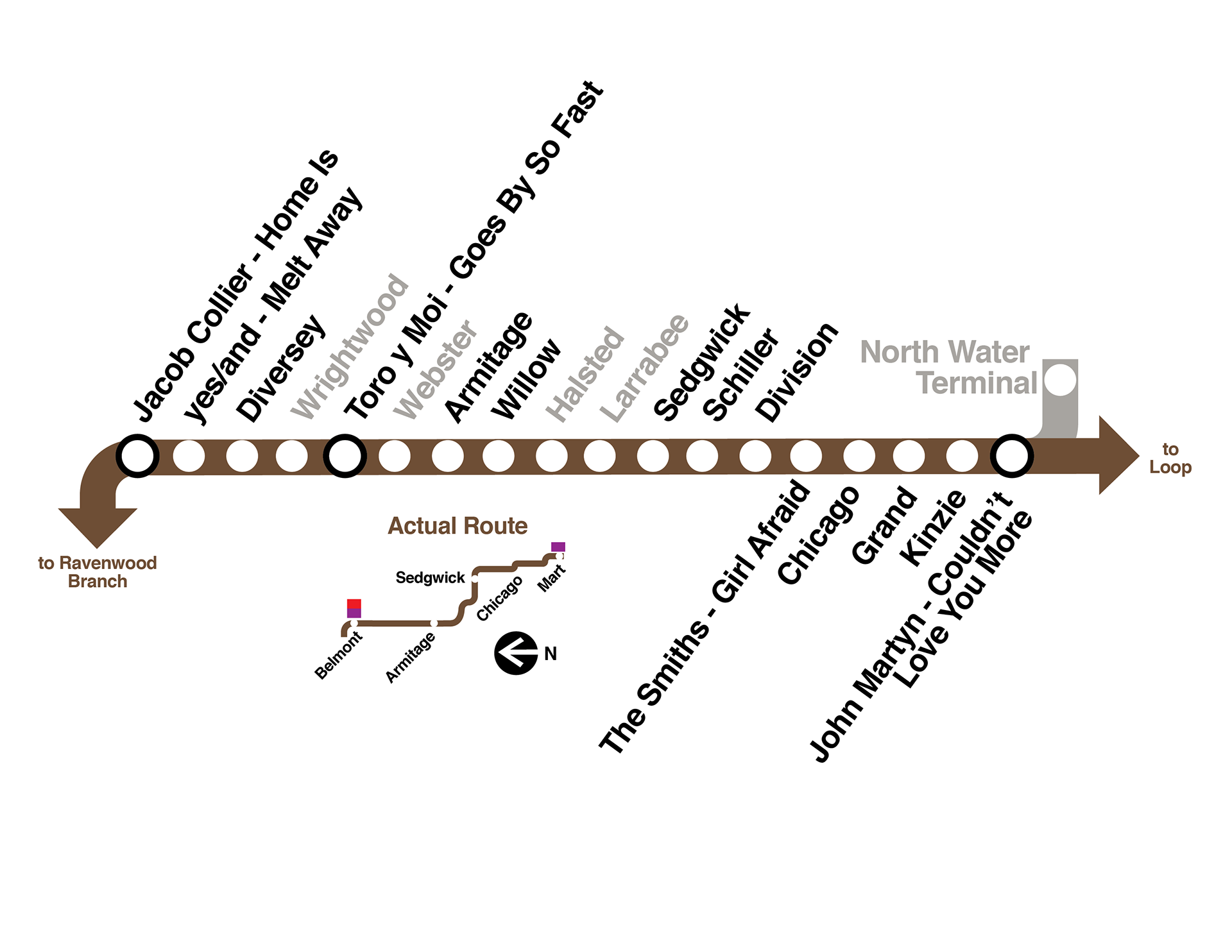
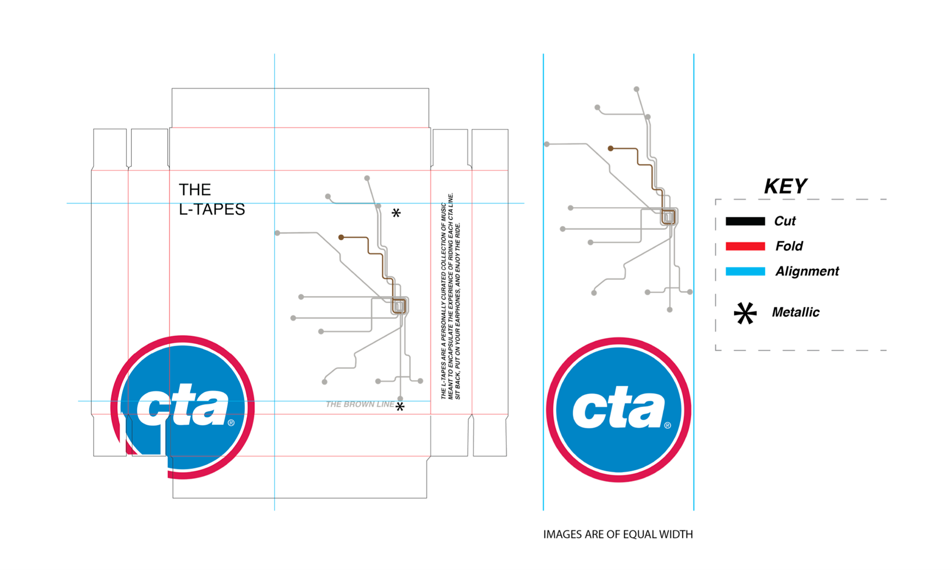
The Concept
With the rise in popularity of tape records, vinyl, and retro-methods of music listening. I felt it appropriate to add to the experience of receiving or purchasing a tape record by designing a box for each tape
The Challenge
Tasked with only being able to use the typeface Helvetica, I took inspiration from CTA’s signage, which strictly uses helvetica in a to-the-point manner. By blending CTA style imagery with my modern takes on the CTA’s line maps, “the L-tapes” boxes efficiently let the audience know what these tapes are used for and when, even without text