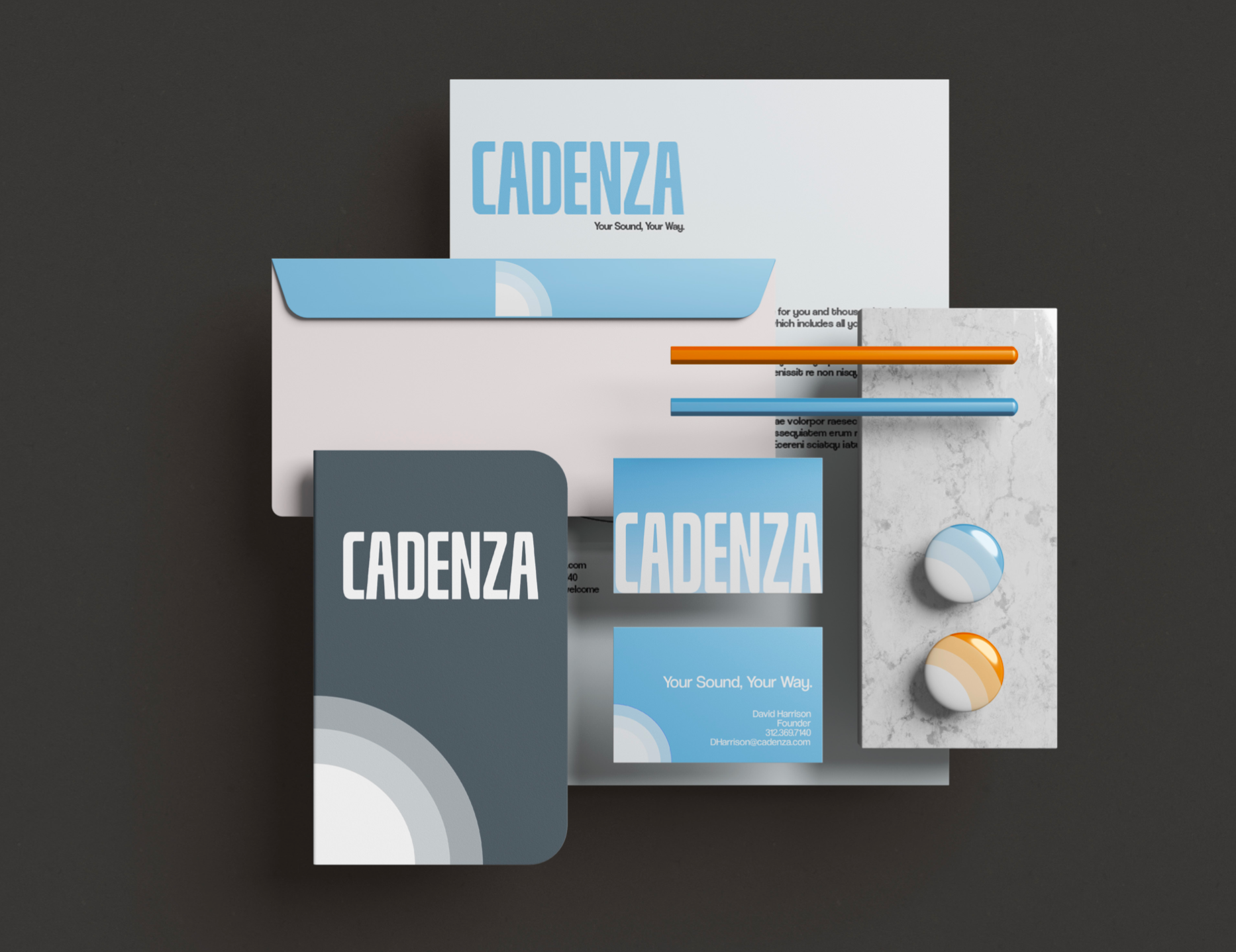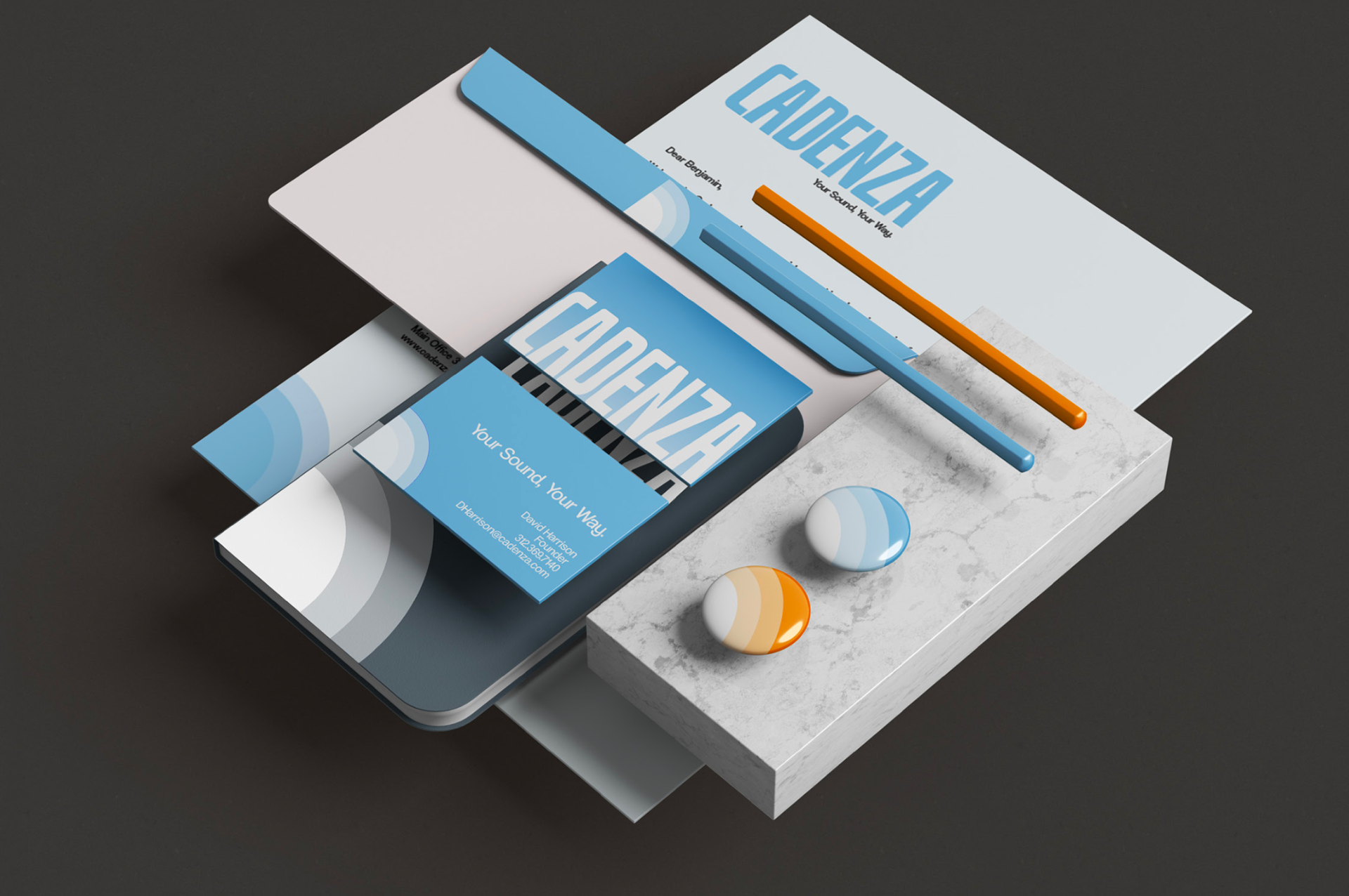
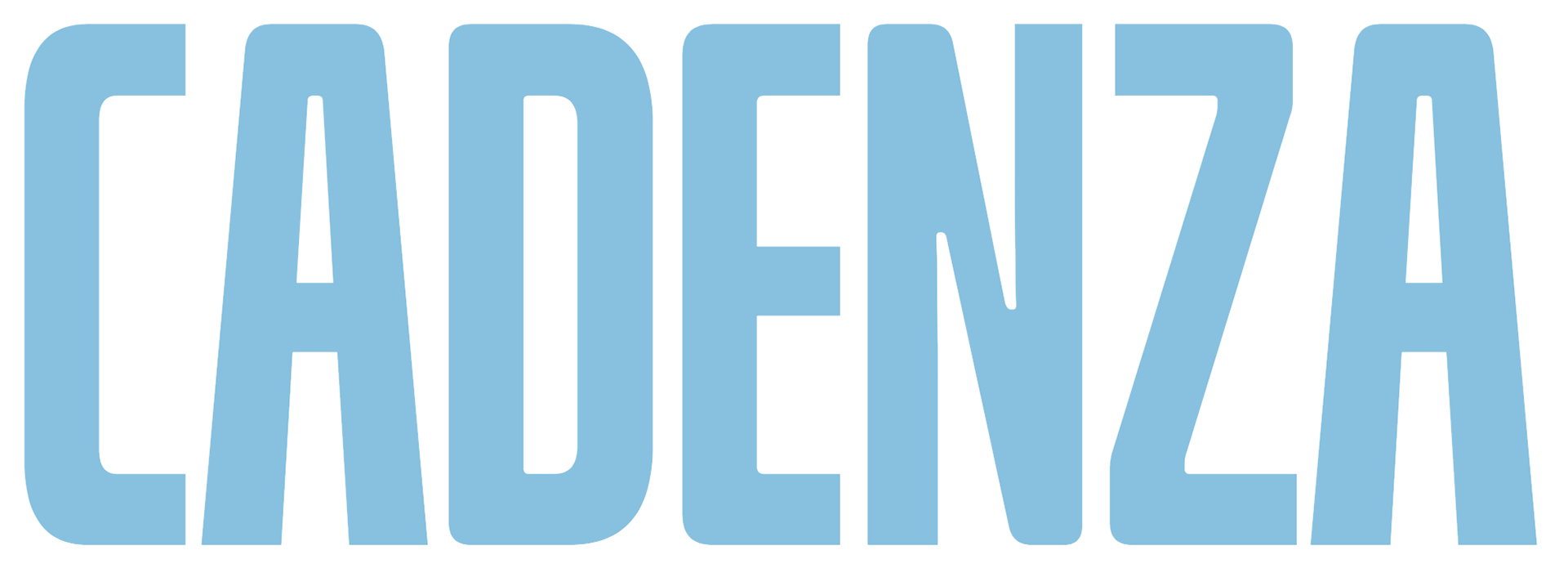
OUR LOGO
representative of who we are as a brand, our logotype holds the visual weight of everything we stand for
This logo should be what out customers think about when they hear "Cadenza"
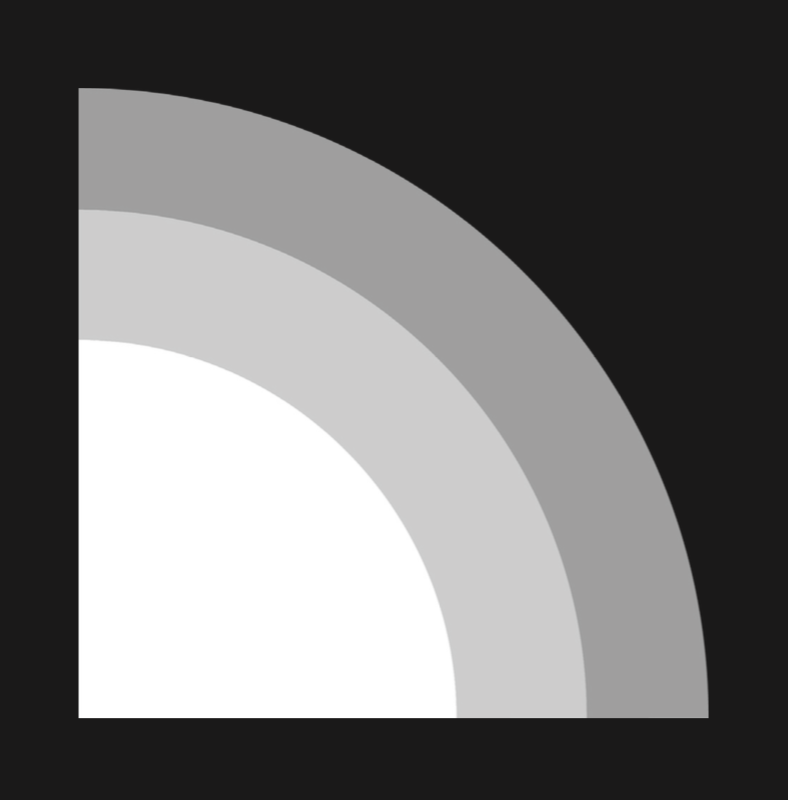
OUR Abstract
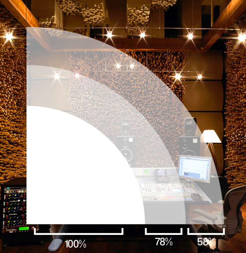
When placed on top of an image, the inner circle should be at 100% opacity, the middle ring at 78%, and the outer ring at 58%
The Abstract should never be reproduced smaller than 1 inch across and never be used more than once in any piece of marketing
TYPE FAMILIES
Our typography is the face to our Cadenza voice. Guidelines must be followed to maintain brand integrity. While there are countless situations that may arise, these guides provide a template that may adapt to any specific situation.
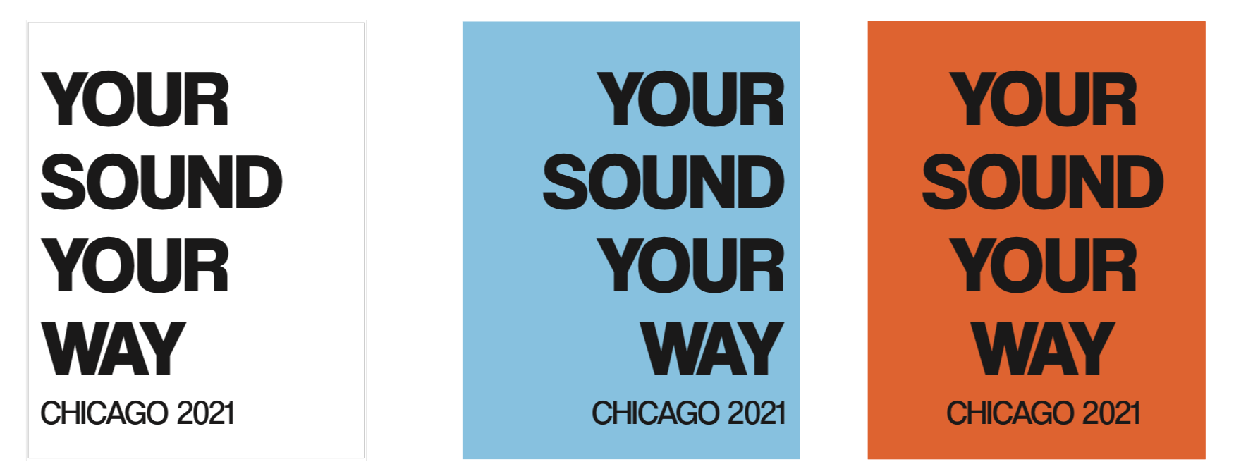
While right and center alignment are permissible if necessary, left alignment is the preferred us
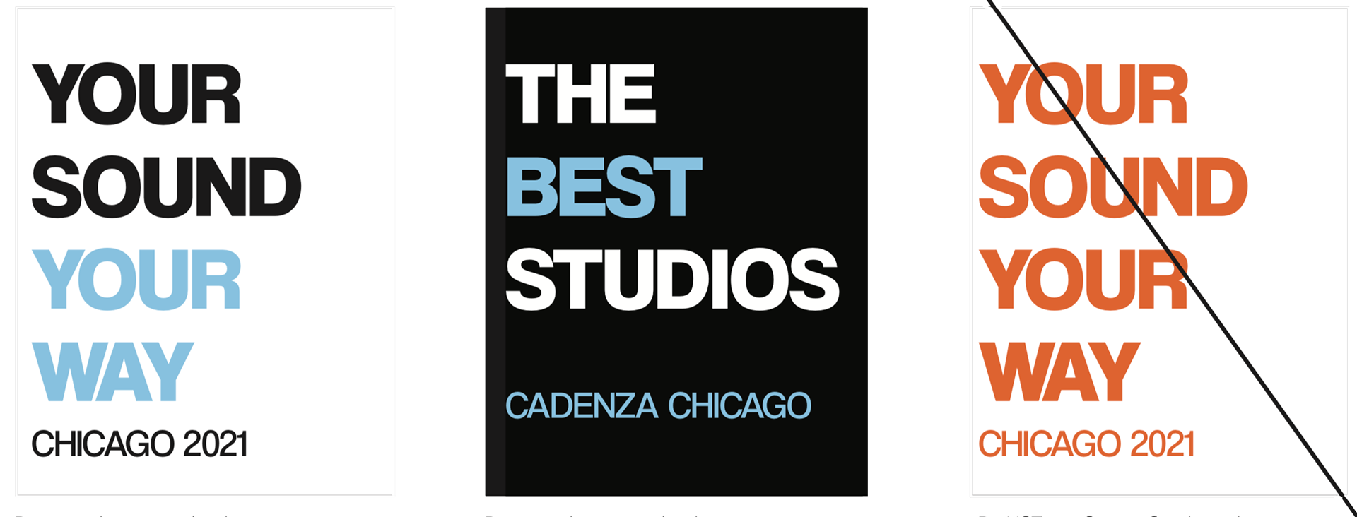
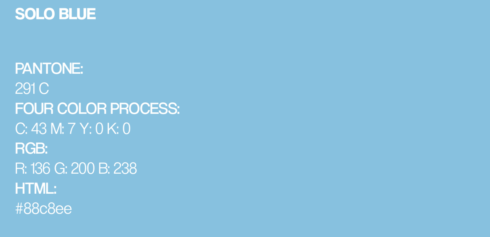
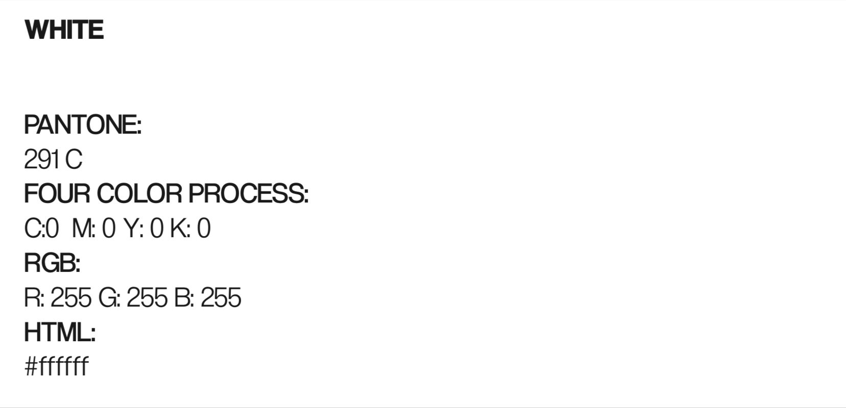
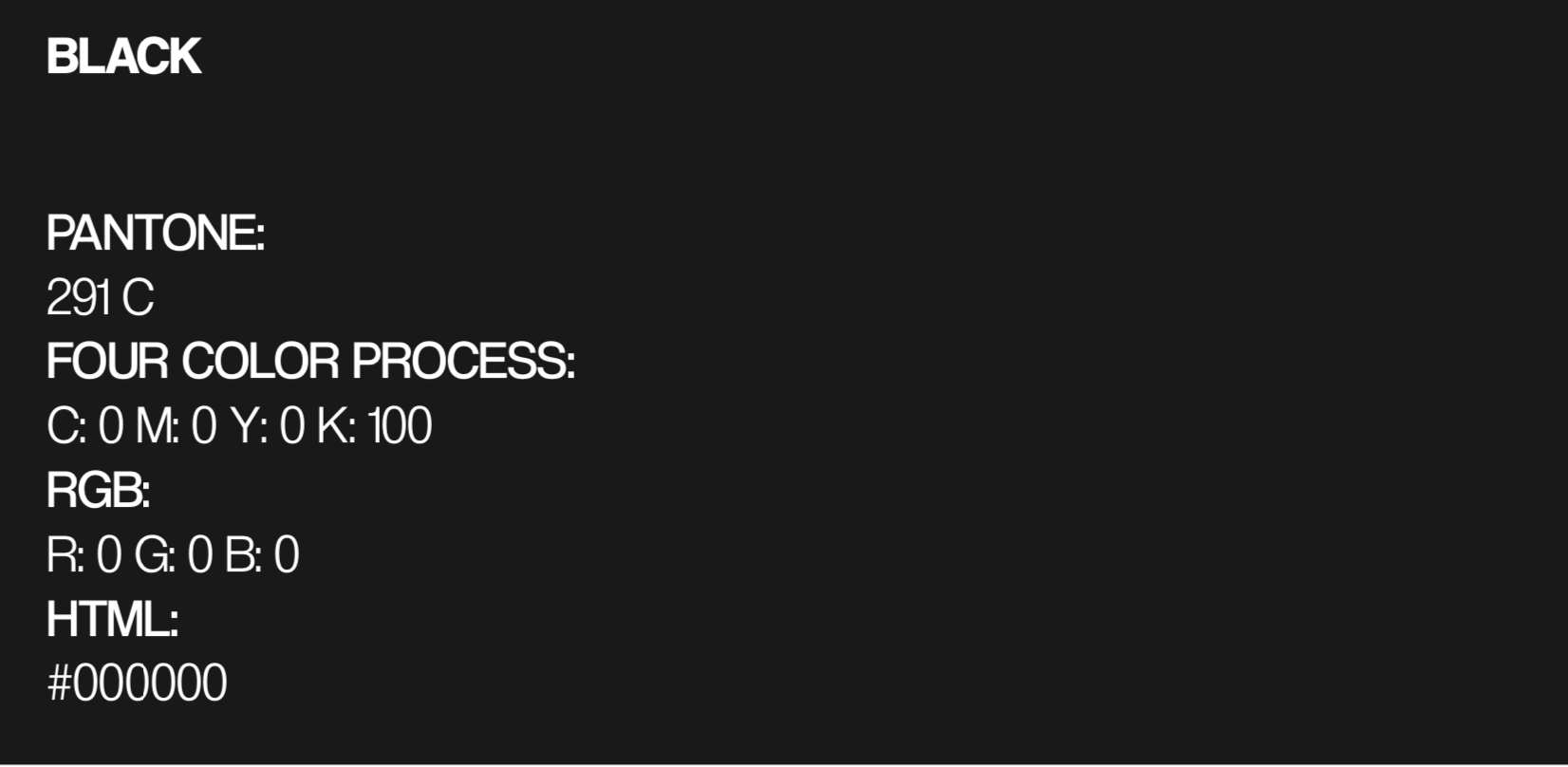
Use color appropriately to distinguish important characteristics of our communication and bring a visual hierarchy to the subject
Do NOT use Orange Spark as the primary typographical color in any circumstance